Corporate vs. Niche Logos: What’s Right for Your Brand?
Here’s the Truth No One’s Telling You
You’d be surprised how many business owners send me logos that are completely wrong for them. Clean. Polished. Safe. And… totally disconnected from who they actually are.
“I wanted to look professional,” they say.
Which is fair. But here’s the thing: you can look professional and look like yourself. You don’t have to choose one or the other.
So let’s talk about the real reason some logos fall flat, even when they’re technically “well designed”, and why at some point, your brand will probably have a full-on identity crisis.
Corporate vs. Niche: What’s the Difference?
When people say “corporate,” they usually mean clean, minimal, modern, and neutral. The kind of logo that wouldn’t look out of place at a big agency, law firm, shipping company or tech startup. It’s safe. Respectable. Legit.
A “niche” logo leans more into personality. It might feel handmade, playful, elevated, moody, bold, emotional, or even a little weird. It has a vibe. It usually makes a stronger impression — and that impression either draws the right people in or sends the wrong people packing, which is actually a good thing.
How to Choose a Logo Style That Fits Your Brand Personality
The real question isn’t which one’s better. It’s:
Which logo style fits your brand personality and business goals?
That corporate look can be beautiful. But if your business is deeply personal, expressive, artistic, or emotional, it might be doing your brand more harm than good.
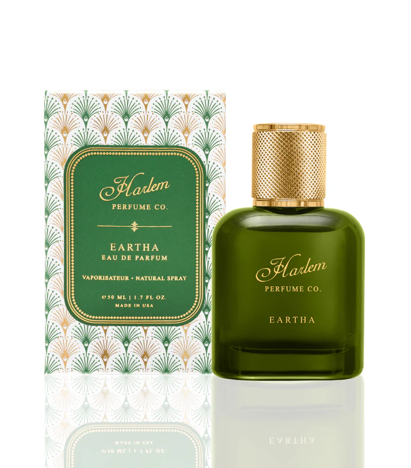
If you’re a life coach, a handmade product brand, or a luxury candle company, you probably don’t want your logo to look like it belongs on a corporate consulting firm’s pitch deck. Unless irony is your thing. Then maybe.
When You Play It Too Safe, You Start to Disappear
I see it all the time. A founder who is warm, funny, thoughtful, maybe even a little bold, and their logo? Cold. Serious. Underwhelming.
Why? Because somewhere along the way, they were told “professional” meant “boring.” And that’s the fastest way to end up with branding that feels off.
You can’t quite name it, but it doesn’t light you up. It doesn’t look like you. You stop posting. You hesitate to print that next round of packaging. You avoid sending people to your website because it doesn’t reflect what you’ve actually built.
That disconnect? It could be your logo.
A Logo Should Be a Mirror, Not a Mask
Your logo should reflect who you are and what you’re building, not try to hide it behind a cool, neutral mask.
Want to be taken seriously? Great.
Want to stand out and connect with the right people? Even better.
Those things don’t come from blending in. They come from showing up clearly and consistently. Owning your space. Saying, “This is what we’re about.” Loud or quiet, bold or understated, just make sure it feels like you.
One Last Thing: Stop Hiding Behind Cute
This one’s for anyone tempted to slap a smiley face or doodle heart on EVERYTHING (and I love a smiley face and a heart, don’t get me wrong!). Look, cute has its place. And if your brand is playful or geared toward kids or intentionally whimsical, go knock it out of the park.
But if your brand is elevated, luxe, thoughtful, or grown-up, too much cute can skew juvenile real fast. It can kill the vibe you’re trying to create. So before you add another bubbly font or little icon “just for fun,” ask yourself:
Is this helping tell my brand story, or just making it easier to avoid showing up with real clarity?
Definitely The Last Thing
If your logo doesn’t feel like you, or you’re in a state of paralysis trying to design one, the answer might not be to “make it cleaner” or “make it pop.” It might be: stop trying to look like someone you’re not!
If your business is growing, your product is beautiful, and your offer is legit, you don’t need to look like a big brand to be taken seriously. You just need branding that feels honest, intentional, and aligned with what you’re actually building. Working with a micro design studio might actually be the secret weapon to get your brand there quickly and on budget.
And if you need help getting there, I’m here to help :)
Still want to go the DIY route my little Canva Queens?… Take a minute and test your brand here, it’s free.